
PURPLE GUITAR NAMED CHARLENE
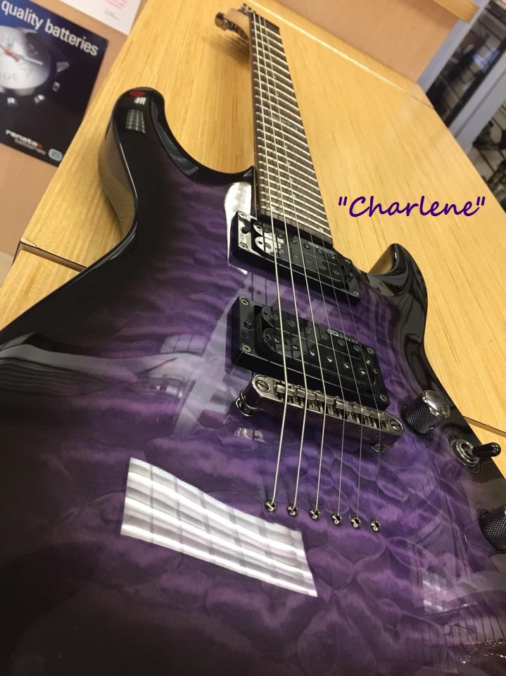
This weekend I was texted a photo of a beautiful PURPLE electric guitar ( ESP LTD MH100 with a quilted maple top) that my son’s friend purchased and has named “Charlene”. Yes, the PURPLE guitar is named after me, a passionate lover of PURPLE who rocks the color daily in clothes and all other aspects of my life since launching my marketing firm, Purple Diamond, in 2008. Why would this marketing and advertising specialist apply her brand color consistently to everything from purple clothing, briefcase, business products, office walls, house doors, furniture, dishes, cellphone case, and even a PURPLE Keurig and teapot? Simple, to be memorable and to offer a color to help others recognize and associate the color with me and my company. I knew that if I showed up at every business networking event in my signature PURPLE that I would increase the odds of other business owners remembering who I was.
Did you know that 93% of shoppers make a decision of what they buy based on color and visual appearance? Color can help persuade people by appealing to their feeling or mood and that is why in marketing the choice of color is very important to a brand’s desired personality. Our brains like recognizable colors and things that stand out. Purple Diamond’s branding color PURPLE is associated with being creative, imaginative and wise so it is not surprising that other creative companies like SyFy, Hallmark and Yahoo all chose it for their branding.
How did you select the color for your logo and website? Did you know that BLUE is one of the most popular colors chosen for branding and that it will put people at ease; it’s the color that is great for businesses that want to be associated with being trustworthy, dependable, secure or responsible. ORANGE, however, is full of life and excitement and can be great to offer a brand image that is playful and fun. GREEN is used when you want to convey freshness or good health, but the shades of green can be associated with different meanings from health and serenity to wealth and prestige. The color RED activates your pituitary gland and increases your heart rate, it’s a color that is associated with attention grabbing, power, love, and energy. If you were a massage therapist you might want to avoid this color in your marketing material. BROWN is an earthy color which conveys simplicity, durability and stability. If you are just starting a business and need help selecting colors or you have been using a brand color in your logo and other marketing material and want to know more about the message contact a marketing specialist like Purple Diamond.
Finally, my thanks go out to my son’s friend Mark who honored me with naming his PURPLE guitar “Charlene”. When I review the great moments that happened in 2015 this will be at the top of the list!